The secret of advertising puzzle mobile games with 100 million downloads? Let’s take a look!
Puzzle games are very easy to start and have diversified gameplay mechanics, therefore such games have always had a large user base. With the intense competition among top puzzle games in the current market, advertising creatives are as much important as game quality for puzzle games in order to acquire users.
SocialPeta has done research on the various gameplay mechanics of the existing puzzle games which are largely classified into the following categories:
SocialPeta selected some brilliant creatives with relatively high estimated impressions from the creatives for several representative games and, after an overall analysis, summarized the design characteristics of those creatives. And, because the first 3 seconds of a video creative are crucial, we've listed the main information contained in the creatives' first 3 seconds, for your convenience.
1. Exploration puzzle: highlight the results
Scavenger Hunt is mainly about finding differences. Players are requested to find out all items on the task list. It takes a long time to complete each list because the items are many and in rich colors. The game was launched in March this year and has received over 10 million downloads in total. The following is one of its creatives.
- Video Length: 28 seconds
- Video Dimensions: Vertical/406 x 720
- Advertising Platform: Google Ads
- Duration: 24 days
- Estimated Impressions: 139.8K
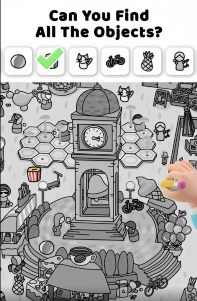
Main scenes: black and white fountain plaza
Main elements: players' hand and pen, green ticks, tasked items, words at the top
Main information in the first 3 seconds of the video:
(1) Question the player's capability to play the game: "Can you find all the objects?"
(2) A display of how to play the game: tick a game item
(3) Keep audience in suspense: can "he" find all the objects?
The most special thing about the creative is that it presents the in-game colorful scenes in black-and-white, and highlights the task items when they are found. In addition, the video is less than 30 seconds during which time the "player" tries hard and still fails to find the last item, making the audience anxious and want to download the game to play it themselves.
Optimizable: The absence of BGM makes the video a little dull. If not background music, maybe the tick of clocks can be added to make people feel the pressure of time.
2. Jigsaw puzzle games: making the audience a "loser"
Blockudoku is a 2D game featuring a mixture of sudoku and block puzzles. It's quite friendly to new players as it has no time limit. However the game becomes more challenging as the player progresses to the next level. Because jigsaw puzzle games are very similar to each other in gameplay, their advertising creatives usually include some modes that are not in the games. The following is an example:
- Video Length: 30s
- Video Dimensions: Vertical/720 x 1280
- Advertising Platform: Vungle
- Duration: 1 day
- Estimated Impressions: 11.8K
Main scene: game interface
Main elements: players' hand, jigsaw blocks, IQ value, words at the top
Main information in the first 3 seconds of the video:
(1) The game difficulty is specified: "Only people with IQs above 160 can complete the pyramid."
(2) Gameplay demonstration: Fit the blocks into the pyramid.
(3) Changed IQs
This creative is visually simple because it doesn't contain many elements, so audience can capture the word message at first sight. Most people would feel challenged by the message: "Only people with IQs above 160 can complete the pyramid." The latter part of the video creative is meant to give audience the sense of participation. A few times of failures and the decreasing IQ value would frustrate audience and make them more anxious to win.
Optimizable: Due to the inconsistency of the game contents and the game creative, players may feel they are tricked into playing the game and are very likely to quit the game. Besides, it may have a higher conversion rate if a button or note reminding players to download the game is added.
3. Physics puzzle: the purpose is to make users complain
Pull the Pin is a physics puzzle game about removing pins in a bottle to send sand cascading into a waiting basket. The game was launched in January 2020 and topped the list of free puzzle games on the App Store in February of the same year. Recently the game has been gaining popularity and received over 6 million downloads in April 2022. So we picked one of its recently-released creatives for analysis. The following creative originally placed on TikTok was captured by SocialPeta:
- Video Length: 26s
- Video Dimensions: Vertical/540 x 960
- Advertising Platform: TikTok
- Duration: 20 days
- Original Link: https://www.tiktok.com/@test/video/7081262437084794113
- Interactive data: Likes: 3.0K Comments: 78 Share: 72
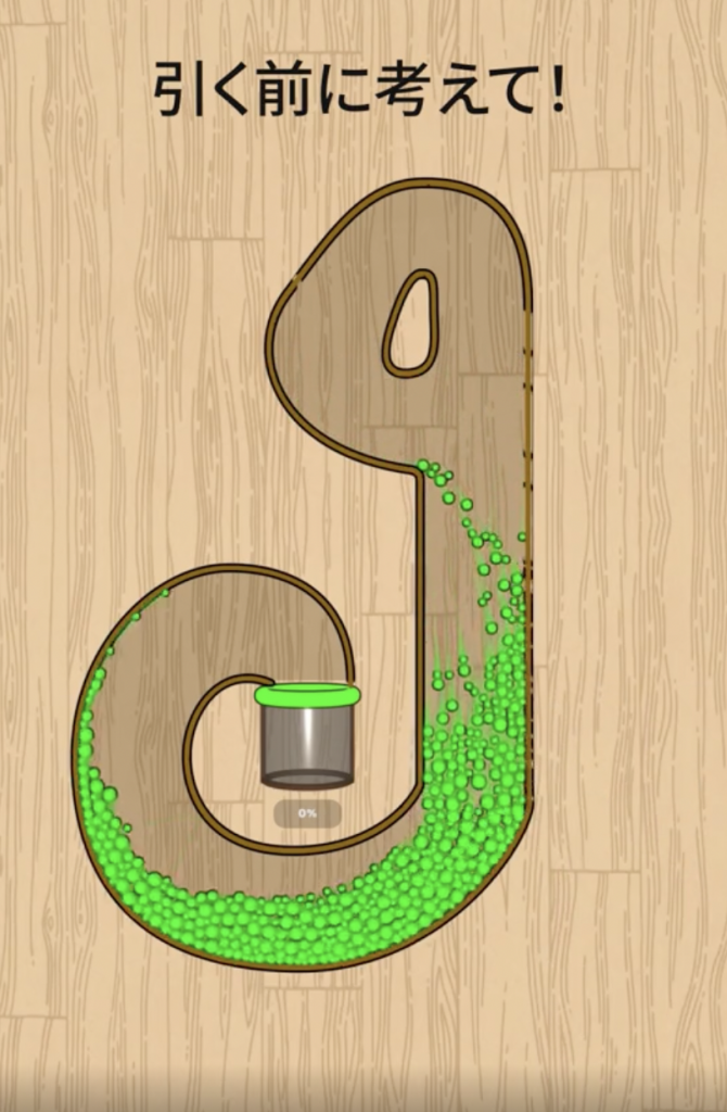
Main scene: Game Interface
Main elements: Player's hand, green sand, pins, tip text
Main information in the first 3 seconds of the video:
(1) Tip text: "Think it through before pulling it!"
(2) Gameplay demonstration: Fill the vessel with sand
(3) Action without hesitation
(4) Very smooth scene of sand flowing
In the video creative, it seems very easy to play the game. But the player acts like a brainless person and makes all the moves without thinking at all, forming a striking contrast to the tip "Think it through before pulling it!" Such a creative showing stupid behaviors works very well on short-video social platforms, receiving a lot of complaints and increased impressions at the same time.
Optimizable: Not in this creative, but there are clusters of background images in other creatives of this game, which probably will make people feel sick.
4. Brain teasers: innovative stages are the best advertising creatives
Brain Out is a brain teaser game. It became a global big hit right after it was released in 2019 and has accumulated over 100 million downloads. The game is mainly about working out puzzles to clear stages. Though there're tips for players in figuring answers, players need to think out of the box to figure out solutions, so they will feel extremely satisfied when they clear stages. The following link is one of its creatives.
- Video Dimensions: Vertical/720 x 1280
- Advertising Platform: Vungle
- Duration: 13 days
- Estimated Impressions: 52.5K
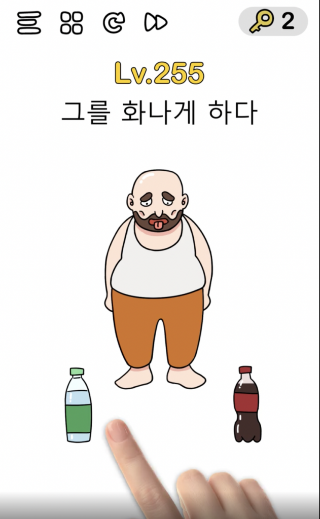
Main scene: Game Interface
Main elements: player's hand, fitness girl, food, tip text
Main information in the first 3 seconds of the video:
(1) Tip text: "What does a girlfriend need?"
(2) Game difficulty: Lv.370
(3) Aid items: 2 keys
(4) Gameplay demonstration: give your girlfriend what she needs
(5) Wrong operation which results in failed puzzles
The creative is a display of several interesting stages of the game, giving its audience a feeling that they are playing the game themselves. A direct display of the gameplay also allows its players to know about the core content of the game, luring players to download the game.
Through an interview with the company's CEO, we understand that their game designers highly participated in designing the advertising creatives. They added some brilliant creatives into the game and had some excellent gameplay mechanics displayed in creatives. That's why the game and its creatives have been updated very quickly. It is very cost-efficient and also can increase user retention rate. You can try it if your game is of the same type.
Optimizable: Comparing with its creatives released a year ago, we realized that the BGM and ending were almost the same, the only thing that changed was the stages. Though it can make the game more impressive, it didn't give much help with acquiring new players. Perhaps some new creative structure can be tried to make a difference.

